Interpädagogica
Corporate Design, Social Media
Agency: Kobza and the Hungry Eyes (KTHE)
About:
Rebranding for Interpädagogica, which is a company in the business of organizing and hosting educational fairs in Austria.
Copyright:
Graphic Design: Nadine L. Keller, Alexander Nemec
Art Direction: Valerija Ilcuka
Copywriting: Marlene Seitlhuber
Monogram
The monogram is composed of simple modular geometric shapes which makes the logo bold and clearly comprehensible. The symbolic behind it is that the “i” stands for an abstraction of a person’s silhouette, as the client requested a connection to humans.

Typography
The font chosen is called “Sora” – a timeless, yet modern sans serif. It is used in three different weights depending on it’s function as seen below.

Colour scheme
For the colour palette we went with vivid “happy colours” in order for the designs to stand out amongst a multitude of dull boringness, as often seen in the field of education throughout the different institutions, ranging from kindergarten to universities.

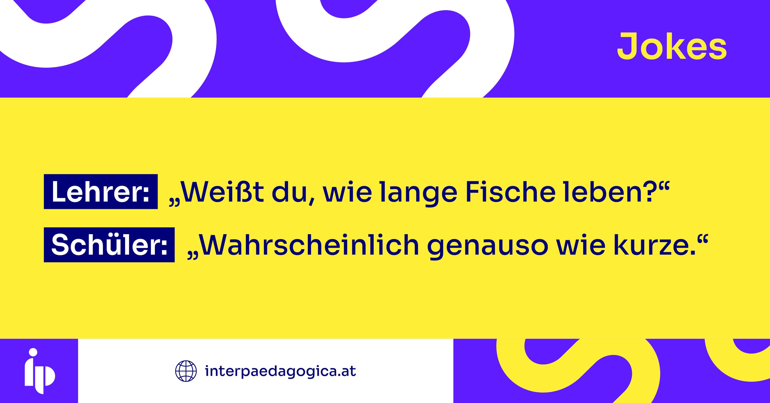
Graphic system
Interpädagogica’s social media content is built on five main pillars which each covers a different topic. Every one of them has it’s own symbol.

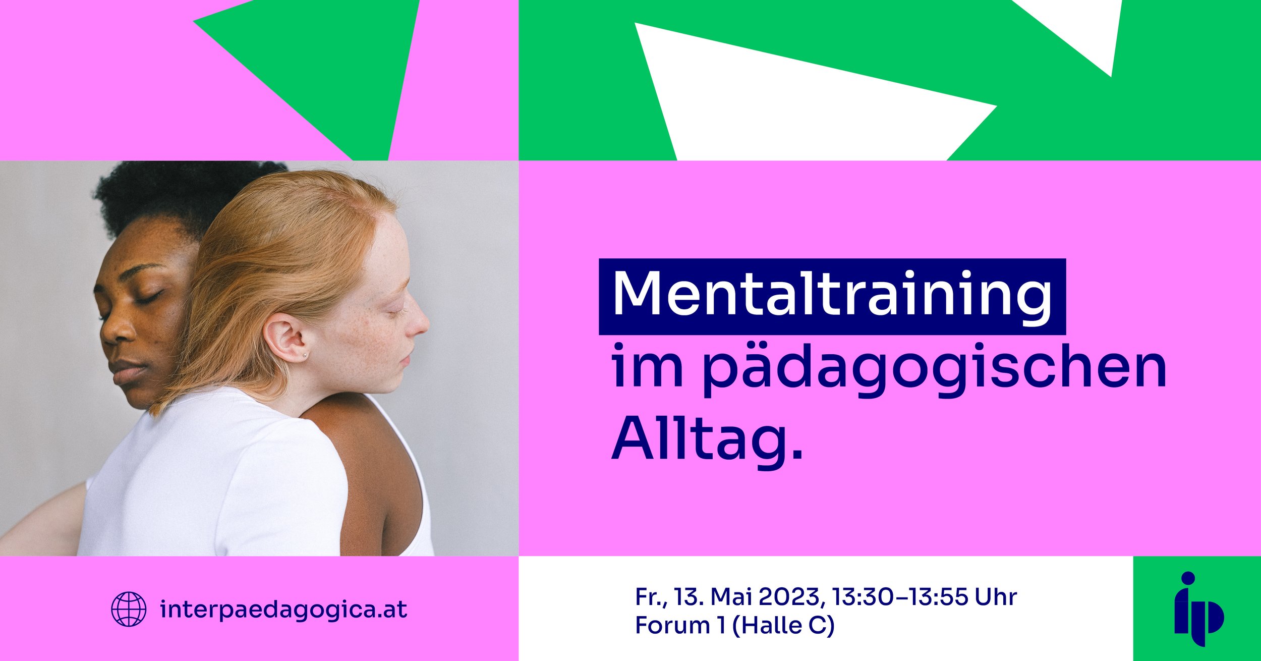
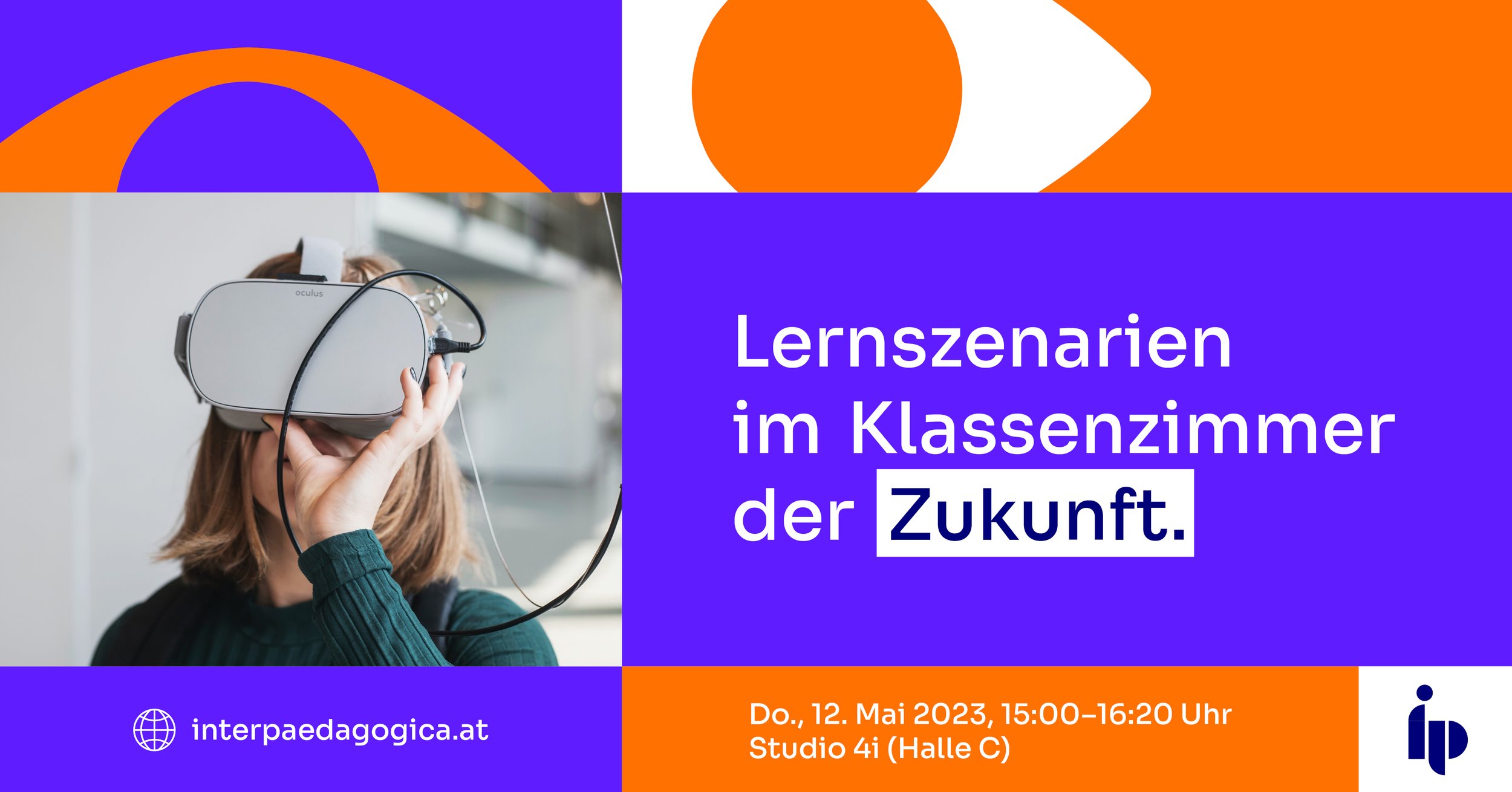
Imagery
The images used as visual support are authentic, modern and clean in style and they show people and various things related to pedagogics.

Application
The client’s main platform is Facebook, so we designed a header image and a series of individual posts, following a modular grid system, as seen below.