Geerenhof
Corporate Design, Web Design
Client: Geerenhof
About:
Lynn G. approached me to create a branding for her farm that she just recently took over from her father. This project contained the making of the corporate design and a website. She owns a flower field in addition to the farm for which I also created a logo in the course of this project.
Copyright:
Graphic Design: Nadine L. Keller
Web Design: Squarespace, Nadine L. Keller
Photography: Lilian Schad

Logo
As the farm “Geerenhof” is first and foremost known for keeping scottish highland cattle and since that is also their main source of income, the bulls head was chosen as the key visual. Paired with the bold typography it makes a striking and distinctive logo. The logo exists in a few variations, such as seen above and with a rough texture that resembles the structure of wood, as shown in some of the mockups further down.

Typography
I chose “Dunbar” as font to complete the logo design because it has a bold character and thereby speaks the same language as the bull head illustration. The modern looking sans serif has quite prominent rounded letters which create a strong contrast to the other characters in the lettering and make the overall logo appear more interesting and dynamic.

Colour scheme
The colour choice here is inspired by the beautiful amber coloured fur of the scottish highland cattle. It also gives off a natural, earthy look and has a warming feeling to it, which fits perfectly to the farm run by the Greteners.
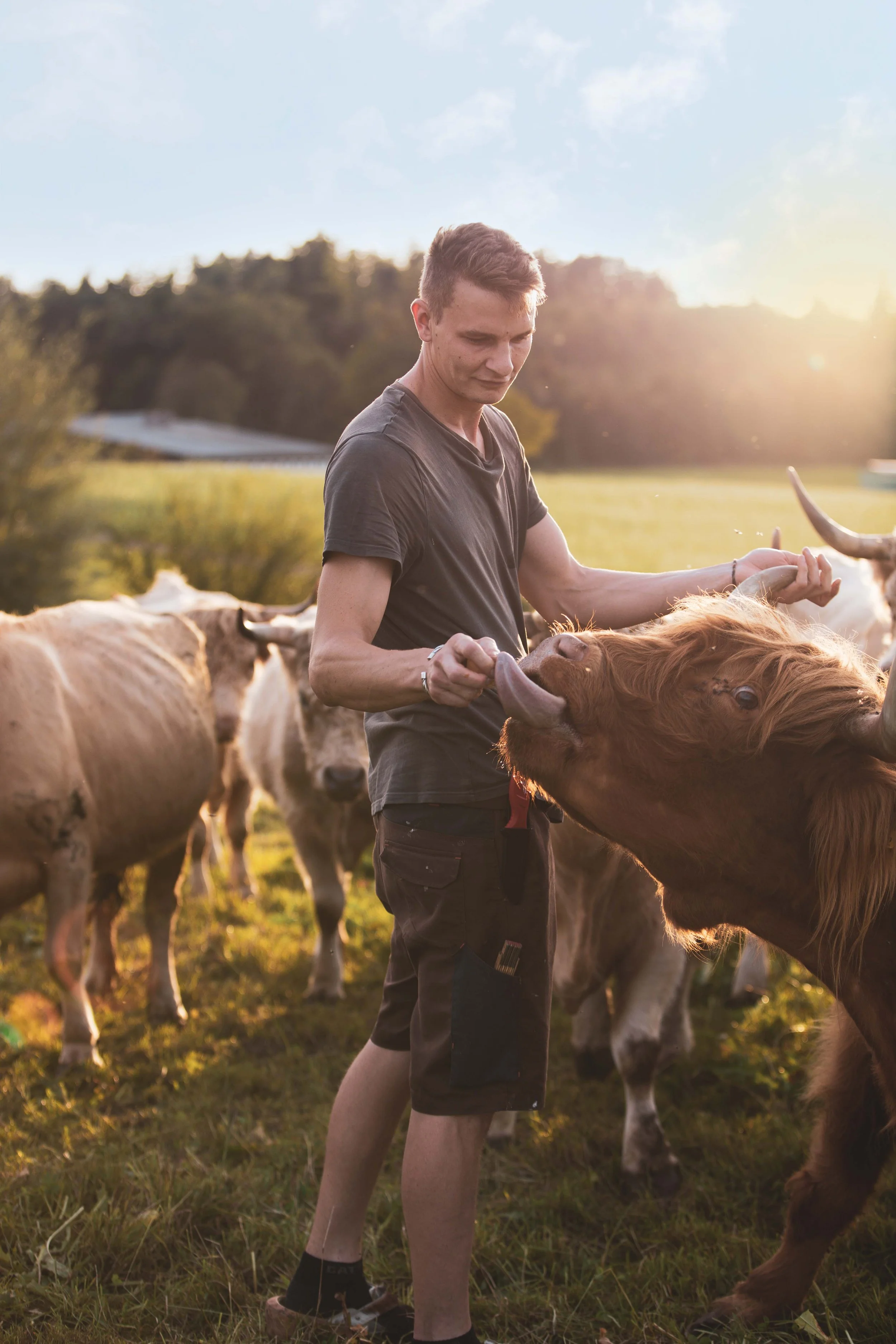
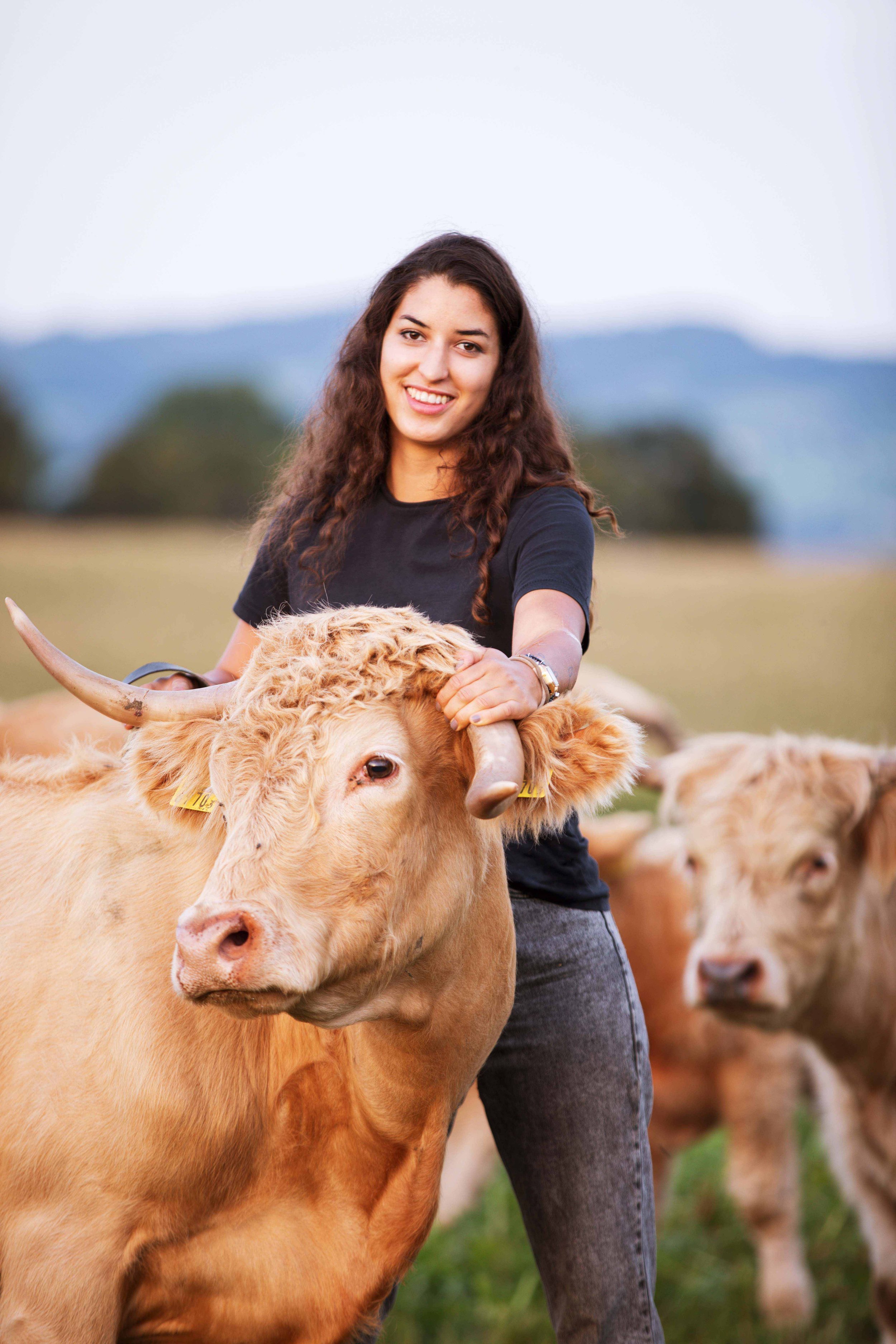


Imagery
The photographs of the staff, animals and produce were taken by Lilian Schad. They beautifully capture the warmth of the team, their respect for nature as well as their passion for farming.

Website
The website tells of the farm’s history, gives some insight into who runs the “Geerenhof”, informs about their self-made products and homegrown produce and gives the opportunity to order online through the contact form.
I created the website with Squarespace, using some of their modular templates while also designing parts of it myself. The images below show the rest of the website.


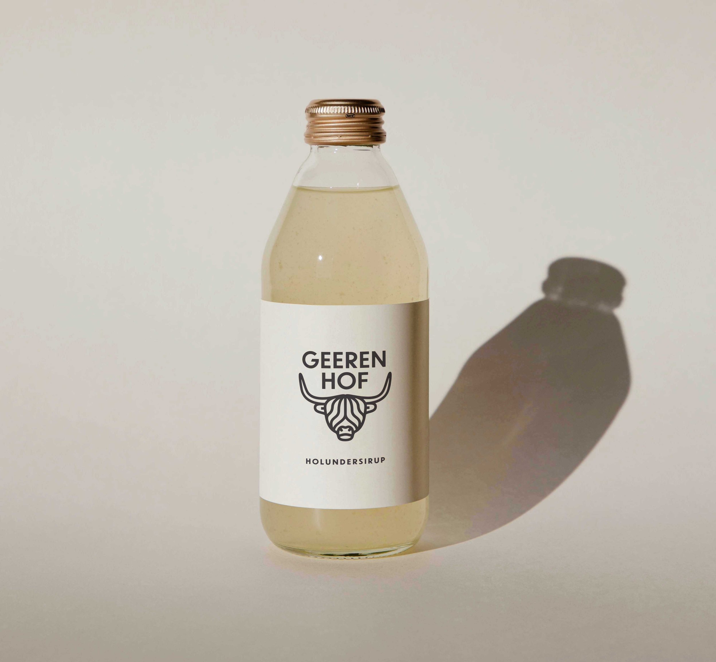
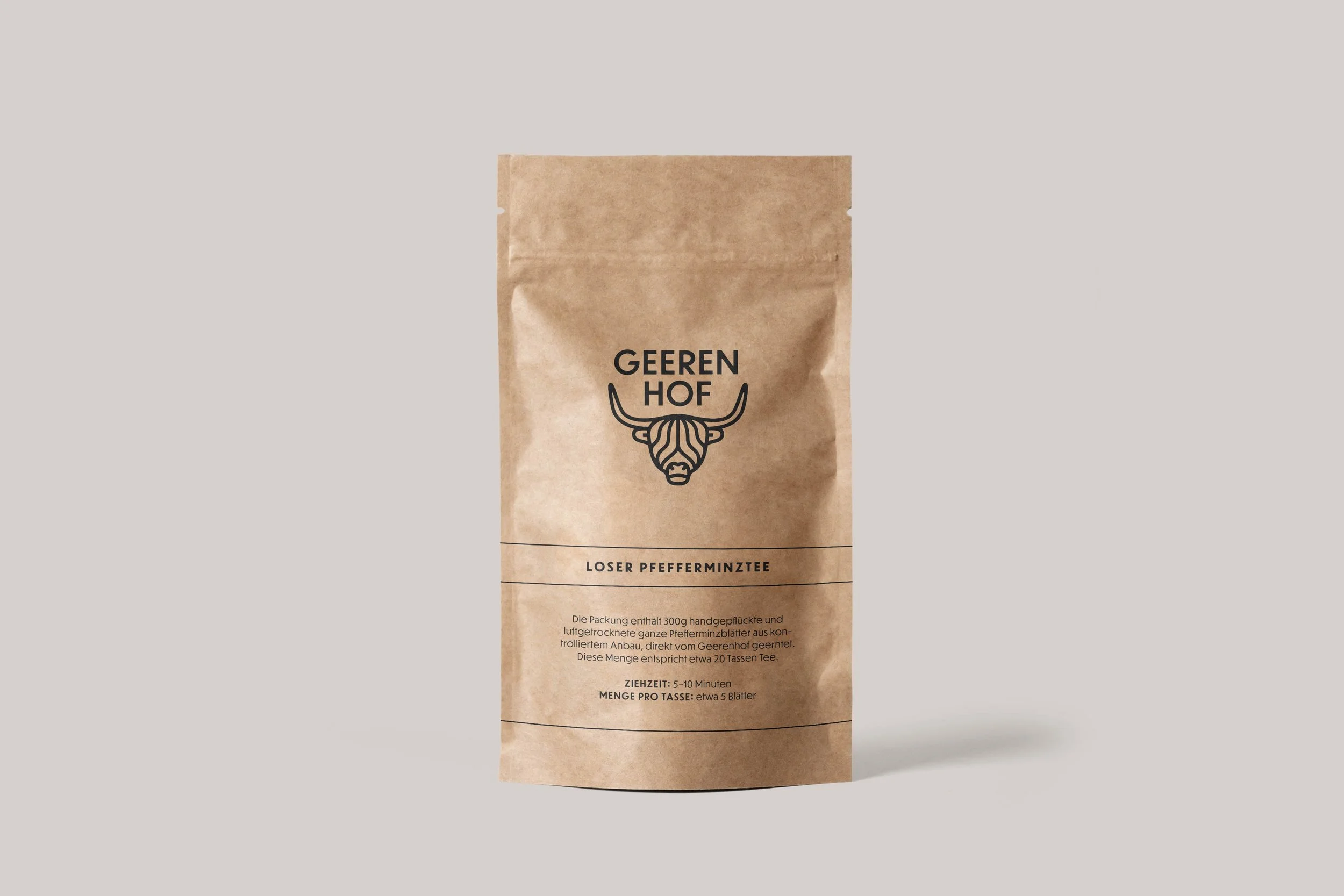
Application Examples
The following images are serve as examples of how the design could look when applied on branded products.

Blumen Feldbach
The client also has a flower field as an additional source of income where people can either go to pick flowers themselves or buy already made bouquets. So the second part of the project consisted of making a logo design for this.
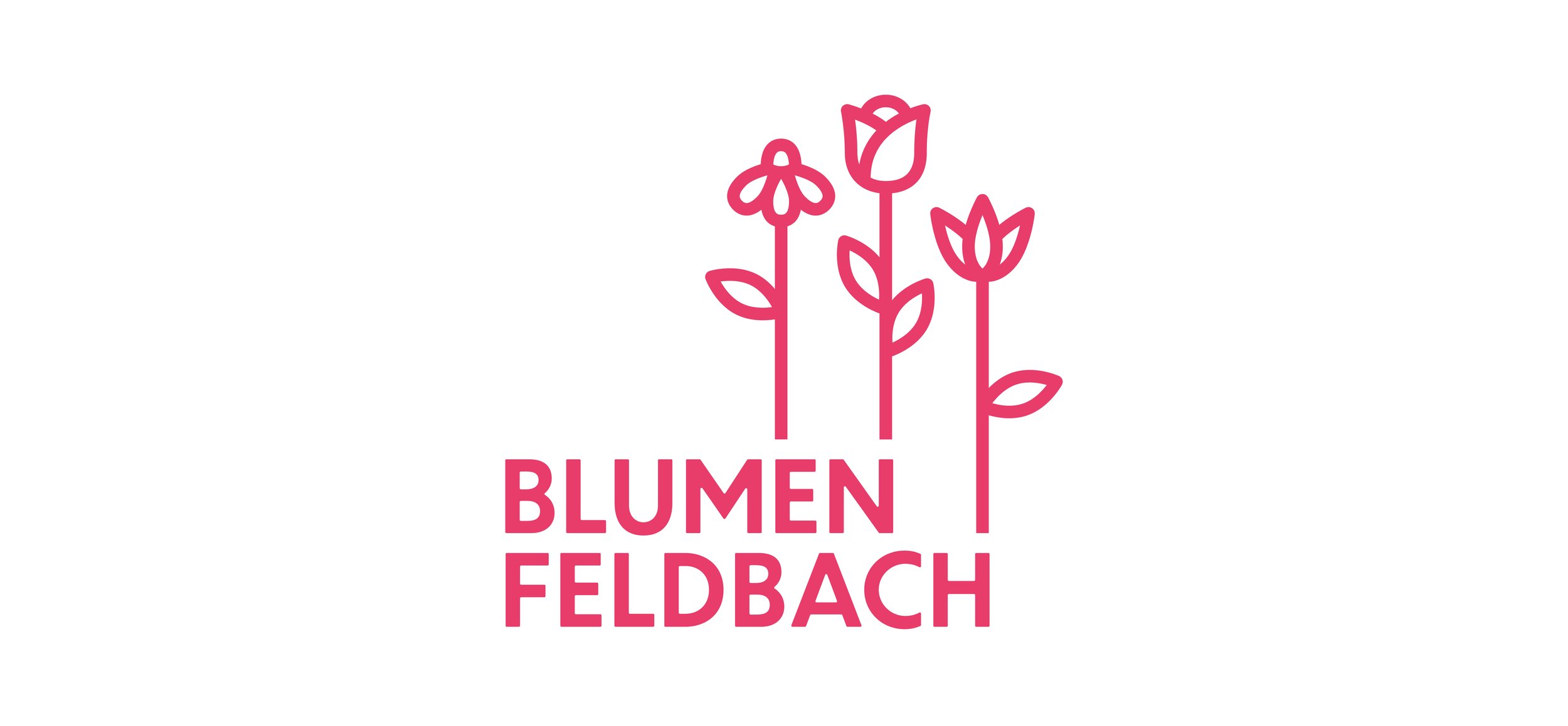
Logo
The logo design for “Blumen Feldbach” is coherent with the design for “Geerenhof” as they belong together to the same company. Therefore the font and the illustration style are the same. The three flowers are wild camomile, rose and dahlia, which are all flowers grown in these fields. The stems are like visual extensions of some of the letters and the flowers are placed next to each other in the design, just as they grow in Lynn’s flower fields on her farm.

Colour Scheme
“Candy” is an energetic, youthful and feminine shade of pink chosen here specifically to give the logo that lively, attractive and lush flowery look.

Application Example
The mockup above shows what the logo mark could look like when applied on a tag. This was not part of the project and serves only as a visual example.