Cyber Peace
Corporate Design
University project
About:
The assignment was to come up with an organization that fights for something I myself am passionate about and to create a corresponding corporate design. So “Cyber Peace” was born – a fictitious institution battling cyber bullying. This topic is generally something quite close to my heart, as many like me have struggled though a phase where this was part of their lives, or still face this injustice.
The project includes logo design, business cards and stationery.
Copyright:
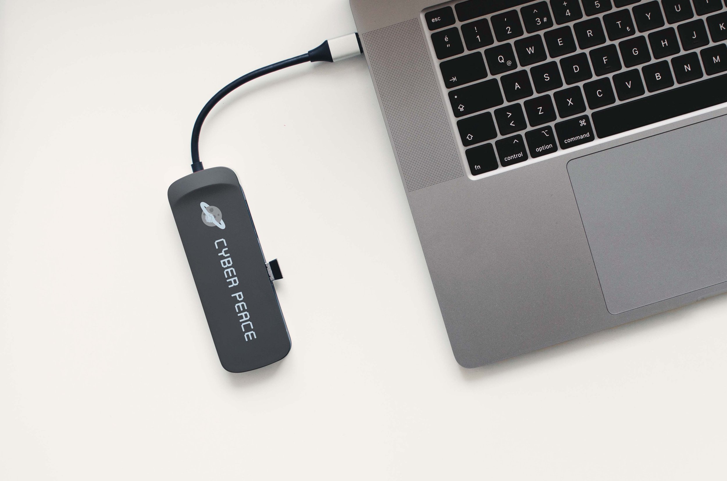
I used a mockup to display the stationery and businesscards. All other content is original.

Logo
The logo consists of a planet encircled by two arms, which connect in a handshake, and the typography below. The planet represents cyber space and the blue hands symbolise peace.

Typography
The font chosen has a very techy, digital look and feel, representing cyber space, such as for example various social media platforms where due to anonymity lots of bullying takes place nowadays.

Colour Scheme
The colours in this project are two different shades of grey for the planet and its craters and a soft blue tone. Grey stands both for technology and the often dark place that cyber space turns out to be when bullying happens and the soothing blue represents the peace aimed to be brought to platforms through this organization.

Application
Part of this corporate design project was to create business cards and stationery for the company, as seen above. The mockups below show a branded bumper sticker and flash drive could look like.