Maierhofer
Corporate Design, Packaging Design, Photography
University project
About:
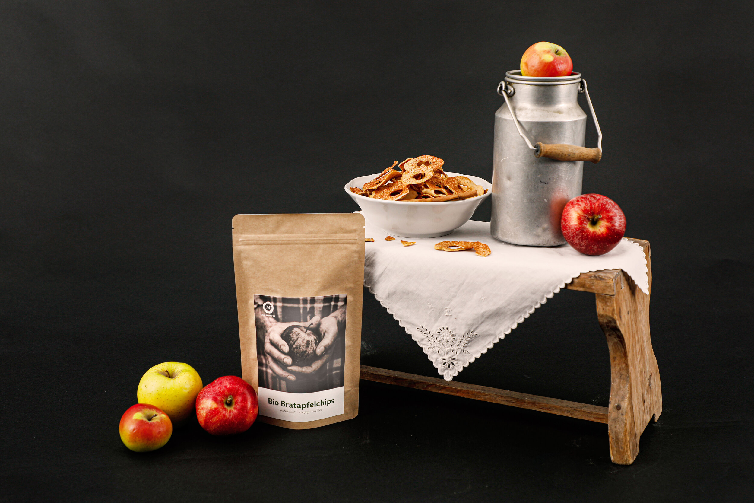
This redesign for an organic farmer from Lower Austria included designing a new logo and making new labels for two of the client’s products of my choice.
Copyright:
All photographs (including product shots) are original.
Award:
After the final presentation, the farmers elected my design second place and rewarded my work with a prize.
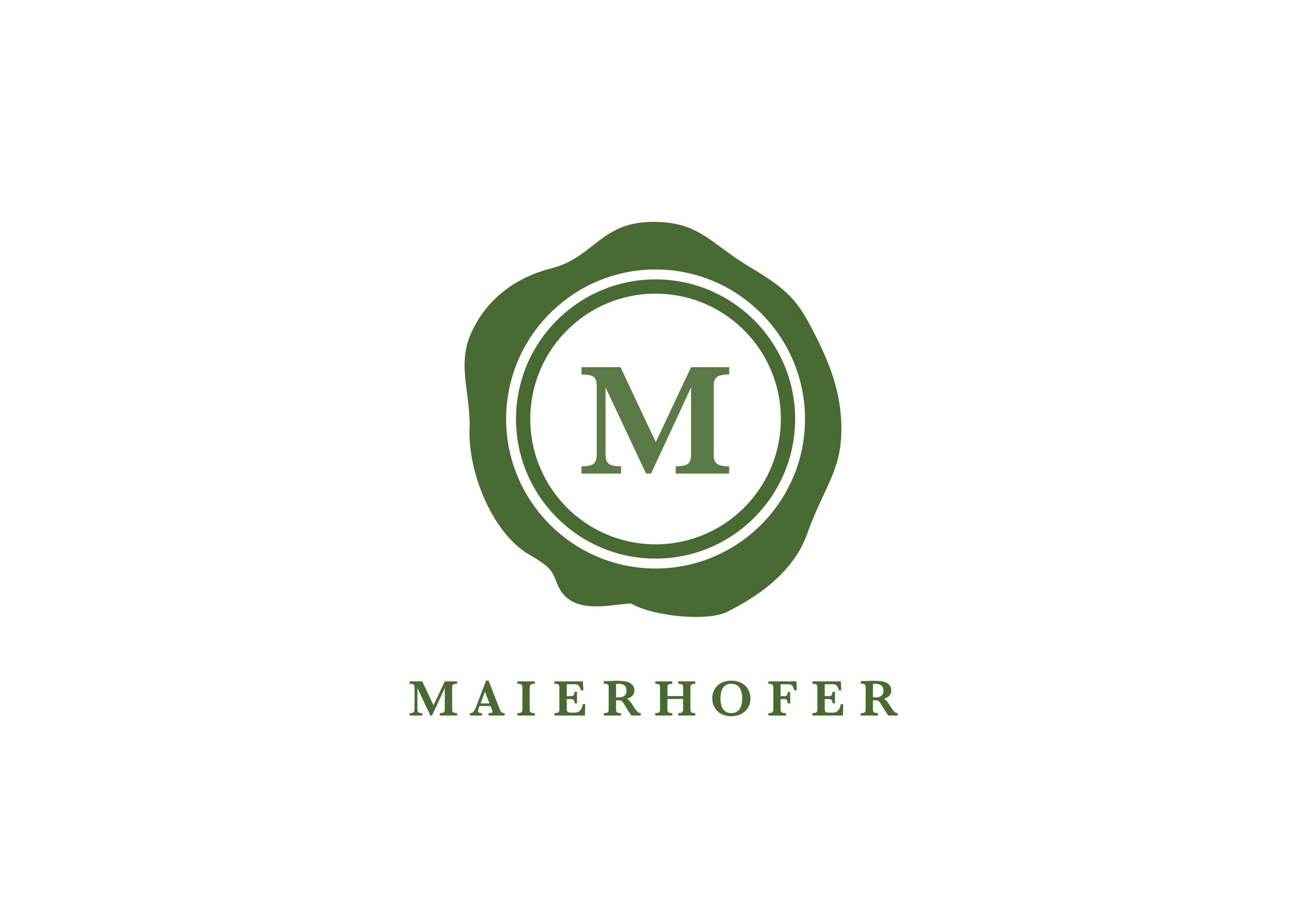
Logo
The farm is run as a family business, with many members of the family involved, across three generations. The logo represents the family and their strong value of togetherness in the form of a seal, with their initial letter “M” in the center. This speaks of elegance, high-quality products, but also the family’s down-to-earth attitude.

Typography
“Baskerville” in the weight “bold” is the font chosen for the logo lettering. It is a classic serif font with an elegant yet still strong character.

Colour Scheme
The corporate colour “Forest Green” was chosen to help communicate that all produce and products are organic and it gives the brand that earthy natural look.


The farmer’s whole family works together, and all products are handcrafted. Meeting the family, their passion for organic farming, as well as their love and respect for nature became evident quite quickly which became the very thing that inspired the concept for the packaging. By photographing hands of different age and gender holding the produce, I was able to convey this same feeling of passion, love and respect for nature and farming. Each pair of hands photographed represents a member of the Maierhofer family.
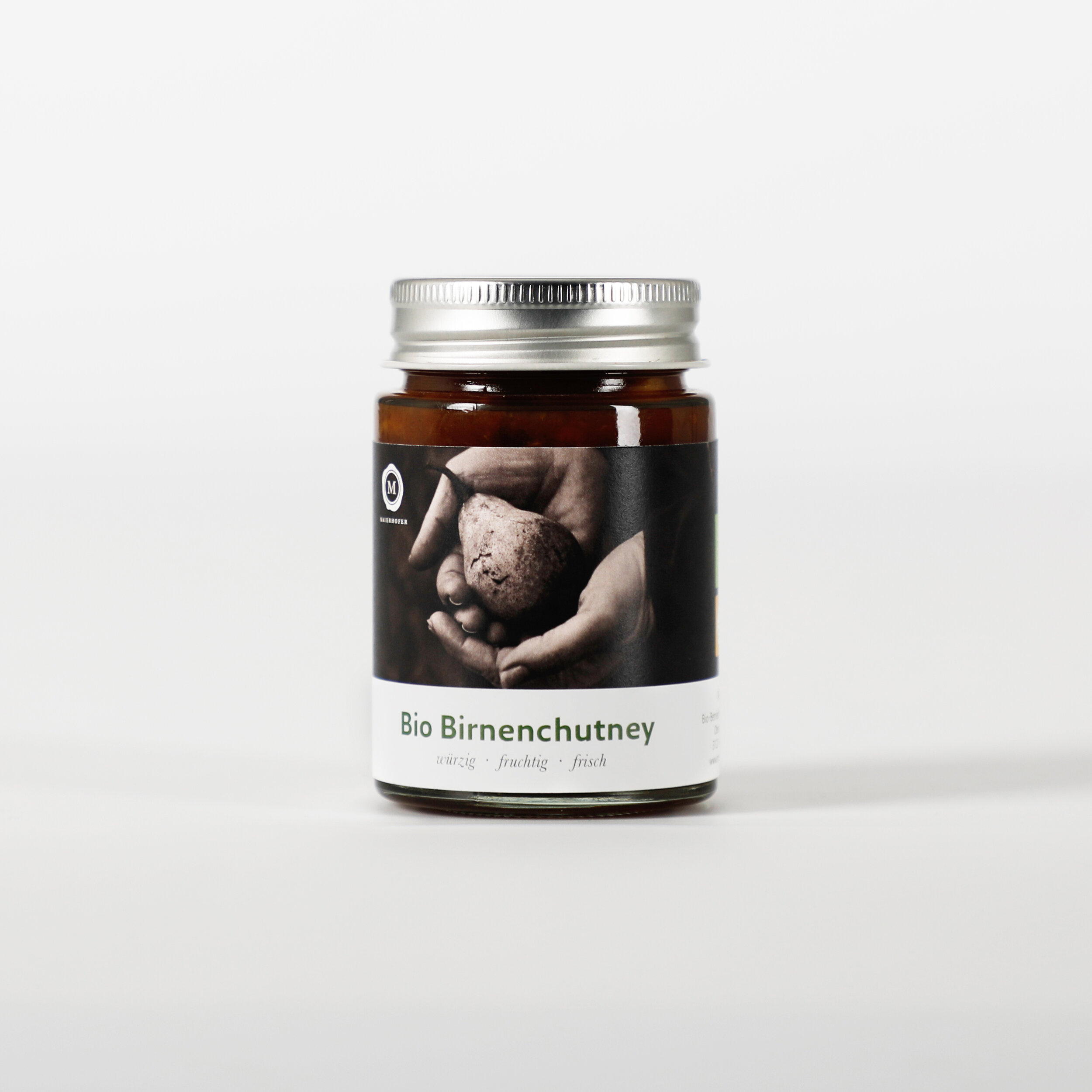
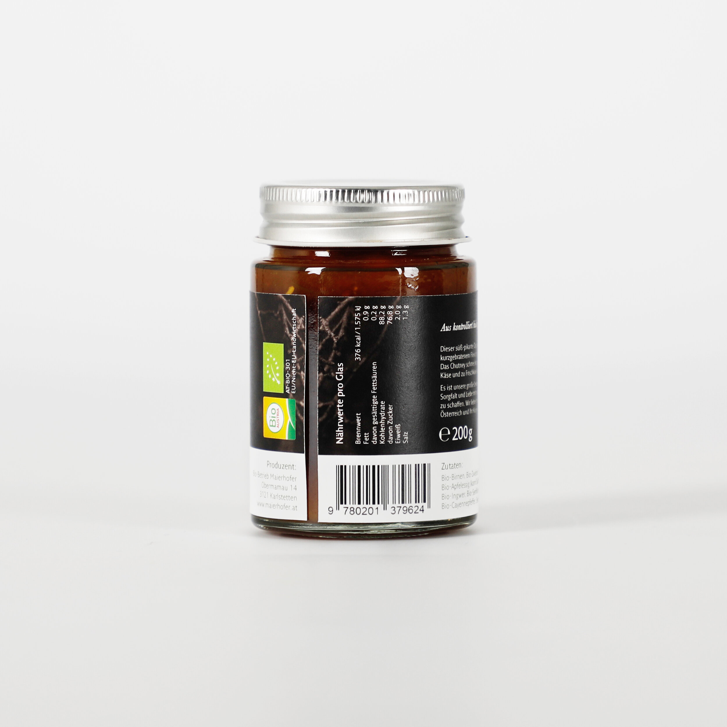


The assignment was to create labels for two different products of the farmer’s range, which in my case ended up being the “Bratapfel” apple chips and the pear chutney.