Worship Austria
Branding, Logo Design
Client: Worship Austria
About:
Worship Austria is an organisation which has the vision of supporting Austrian musicians from the sector of christian worship music through supplying them with a wide service that ranges from an online sheet music platform to organising seminars and conerts, etc.
The client received two design options to decide from, which are presented below.
Copyright: Nadine L. Keller
All content is original.
Route 01: Continual flow
The key visual is a monogram of a combination of the letters “W” and “A”, which stands for “Worship Austria”. The shape symbolises worship as being something that flows continually. The gradual transition of the colours also underlines this principal visually.

Typography
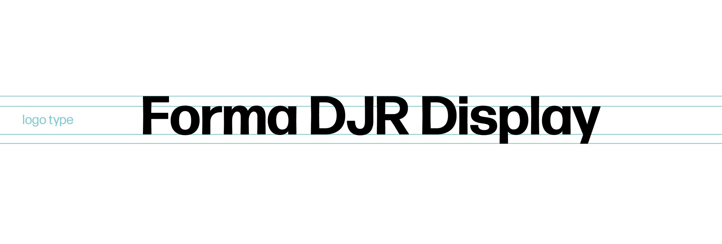
The font chosen is called “Forma DJR Display” which is a timeless sans serif, with some nice quirks like the slightly slanted verticals, which gives it an interesting and friendly feel, while still remaining professional and well legible.
Colour Scheme
The gradient is made up of blues and purples. The lighter blues have the symbolic connotation of peace and freedom. This represents some of Holy Spirit’s attributes, who plays a very central role in worship. Purple on the other hand is known to be a colour of royalty and priesthood. In this case it represents God’s children as his royal heirs, who are called to live a life of worship. As worship is never solely coming from us humans, but is also led and inspired by Holy Spirit, the gradient symbolizes this unity and fluid interchange.


Route 02: Traditional meets modern
This monogram is also a combination of the “W” and the “A”, however the letters are two very contrary styles. The “W” is a modern sans serif and the “A” an old blackletter type. This touches on Austria’s long and famous music history which ranges from classical, traditional to modern, contemporary music.


Typography
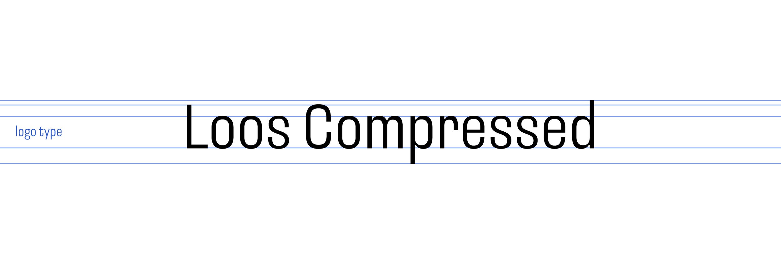
“Worship Austria” is set in a grotesque font in a compressed style. Overall it gives off a modern look, surprises with some interesting details and has a slightly elegant vibe to it, due to its slender look. The two initials are in contrasting styles: modern sans serif and old blackletter type, as mentioned and explained above.
Colour Scheme
The colours used in this concept are a bold blue and playful pink. These were chosen to bring together the rich Austrian history of classical (blue) and modern (pink) music. They are meant to contrast but also to complement each other. The colours give this logo a bold and modern expression.


Current project status
Since there has been some back and forth on the client’s side in the naming process, sadly none of these logos were chosen in the final decision. The name has now been changed to “Österreich lobt” and their new branding has yet to be made.