Psychotherapie Kosbab
Corporate Design, Flyer Design
Client: Mario Kosbab
About:
This corporate design project was made for a person-centered psychotherapist in Vienna, Austria. The project included designing a logo, business cards and a pamphlet to introduce the therapist and his practices.
Copyright:
All content is original, apart from the mockups showing the business card and the letterhead.
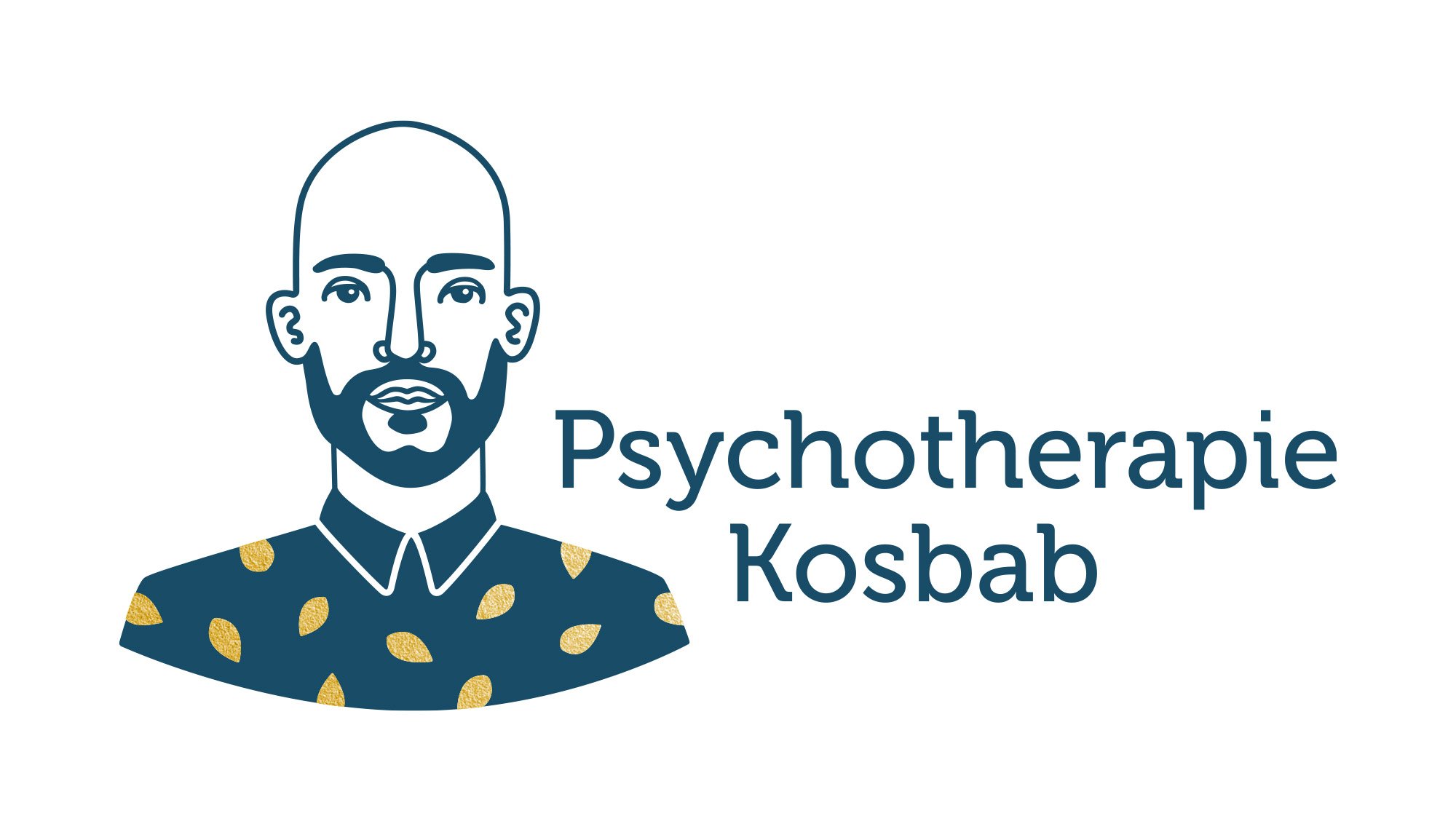
Logo
The logo design consists of an abstracted illustration of the therapist and the accompanying typography. The leaves symbolically stand for growth, while the patterned shirt at the same time is an accurate representation of the therapist’s clothing style.

Typography
“Museo” is the name of the sans serif used in this project. It is a font with a friendly and sympathetic yet professional character, which reflects who Mario Kosbab is as a person and therapist. The type is set in “500” which is a medium weight, slightly thicker than Regular.

Colour Scheme
An elegant, dark teal was chosen as the corporate colour, and in print hot foil stamping was used for the golden accents (leaves) on the illustration. Both colours offer rich symbolism for psychotherapy. Teal is a colour that draws on the calm qualities of blue and the revitalising effects of green. It also speaks of a clarity of mind, while gold stands for desire and success.


The therapist is being introduced to possible clients through this pamphlet, which is on display at various kindergartens and medical practices.
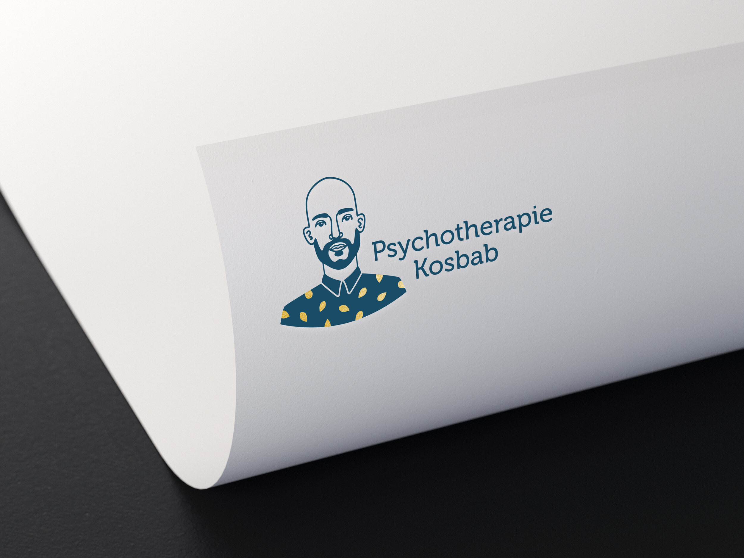
The letter head displayed below is just a visualization of what the logo could look like on stationery.