Kalaga Physio + Fitness
Corporate Design, Web Design, Print
Client: Kalaga Physio + Fitness
About:
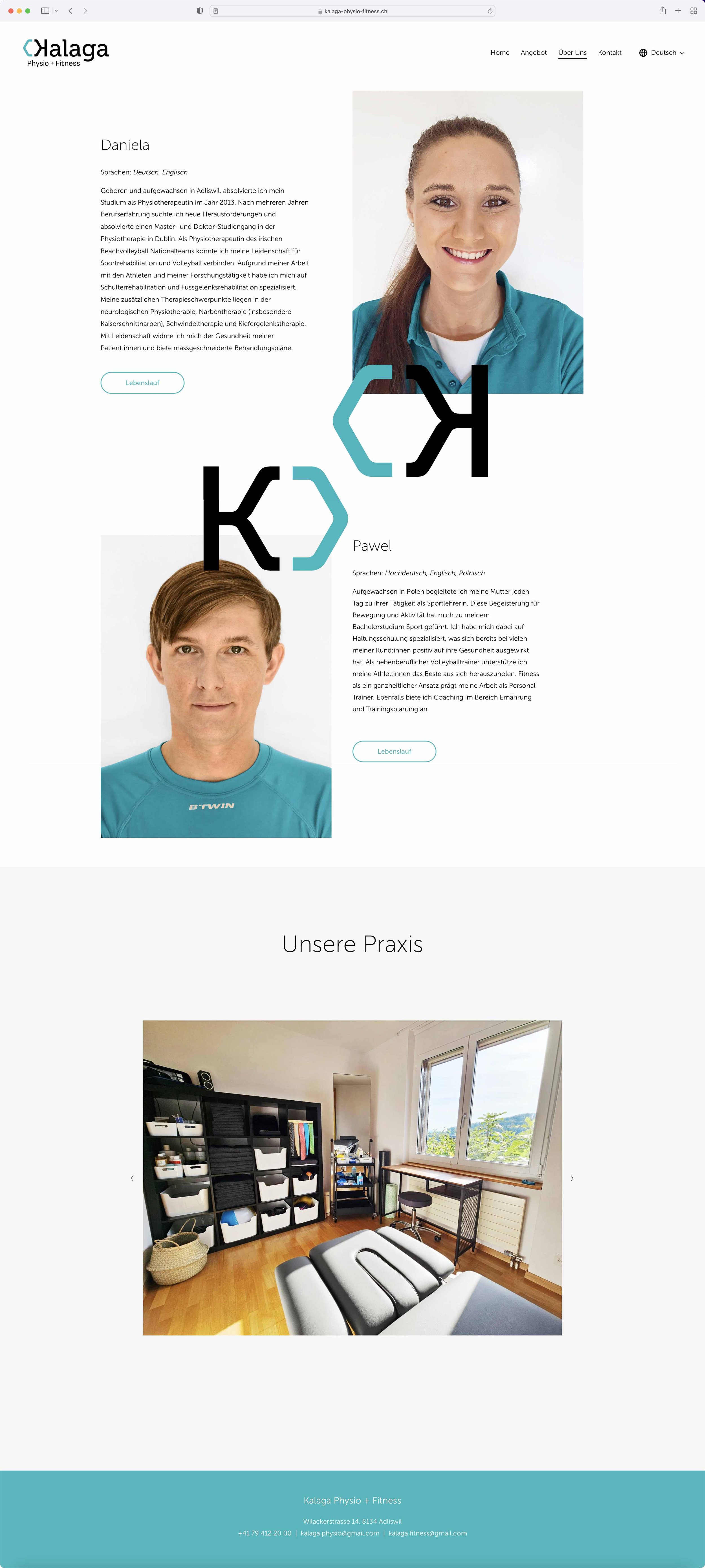
Branding project for physical therapist Daniela Kalaga and her husband Pawel Kalaga, who is a personal trainer. The design reflects their professional competence and modern approach to health and fitness. In addition to their main branding, they also needed me to create a second logo for their small fitness studio called “Bunker Workout”.
Copyright:
Nadine L. Keller: All content is original.
Logo design
The letter “K” is reversed to complete the hexagon shape of the icon and thereby perfectly blends together the logo symbol and the word mark.
Originally seen in nature, the hexagon has become a sign of strength, stability and efficiency. It reflects the brand’s purpose of connecting physical therapy and fitness training as a modern and wholistic approach to promote a healthy lifestyle.
Monogram
The monogram is composed of the duplicated and mirrored “K” with the hexagon shape.
It serves as a decorative symbol, as well as a sort of signature for the couple “Kalaga & Kalaga”.

Typography
Both fonts chosen are sans serifs with a modern and professional character, while “Museo” has some playful and friendly details, Loos is the more reduced and down-to-earth secondary type.

Colour scheme
The colours selected are a nicely balanced shade of turquoise and black as the classic counterpart. Together they convey a professional and yet friendly look to the brand.

Business Cards
For the physical therapist, I designed a set of business cards with two front sides differing in colour.

Website
The client’s website was designed to provide information on their work philosophy, pricing, the therapist’s profile and contact details. The website was created with Squarespace.


Bunker Workout
The couple also runs their own little fitness studio called “Bunker Workout” for which I created a graffiti logo. The reason for this name is that the gym is in a basement which is bomb-proof, as it is still quite common in Switzerland these days.
Logo Design
As this is a project run under “Kalaga Physio + Fitness”, we built a visual bridge by keeping the colour “ocean” in the gradient of the graffiti lettering and then added a bright, striking orange for contrast. The writing is made up of letters hand-drawn by myself.

